
Michael is a creative and strategic product design leader in New York City.
Designing teams, products, and services at Oscar, Thrive, BetterUp, Method, Fjord, AKQA and more.
Linking at Linkedin, emailing at michael@michaelfarley.com.
Product design & leadership
Michael is an experienced leader across start-ups, design studios, and consulting, through which he's designed and built both teams and functions. For a decade, Michael has been a part of the leadership teams at each organization he's worked in. In particular, he is highly experienced in creating a narrative-driven product with a clear vision.
Oscar
Currently VP Product Design, overseeing product design and innovation. Working to make healthcare a better experience for humans.
Thrive
VP Design, overseeing product, brand, and marketing design. Primary focus on revitalize an aging experience. Building the design team from basics, including defining process, roles and responsibilities, and vision.
Read more about Michael’s work at ThriveBetterUp
Director of Product Design, member of the product leadership team, and creator of the product design function. Responsible for leading the design team through continuous discovery, embedding narrative in every member's experience.
Read more about Michael’s work at BetterUpMethod
Executive Creative Director, responsible for team building and development, project vision, and strategic positioning of the Method brand around the world. Specifically co-led the creation of Method's future service offerings.
Read more about Michael’s work at MethodFjord
Group Design Director, responsible for leading service and product strategy and design across the New York Fjord studio. Co-created the Fintech and Start-Up Business Group, trying to make dollars and founders think more human.
Read more about Michael’s work at FjordAKQA
Creative Director, in charge of multiple large accounts in partnership with an Account Director. Manager of designers and writers. Responsible for creative output and excellence, client partnership and relationship, and inspiring innovation.
Read more about Michael’s work at AKQAPersonal explorations
With a foundation in the shaky world of the 90s dot com boom, and a bi-coastal, international history, I've learned to have a side hustle. If the world is prone to crumble around you, might as well have a backpack ready.
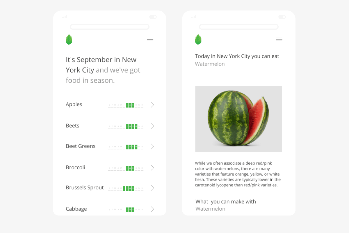
Freshly - Fresh, local, food for family and the mind.
For years, when I become stuck in a problem or take an interest, I will learn by doing - using Freshly as the canvas. Most recently I developed a business model for Freshly to become a food incubator, connecting urban farms and makers in disconnected cities - creating a food brand in the process.
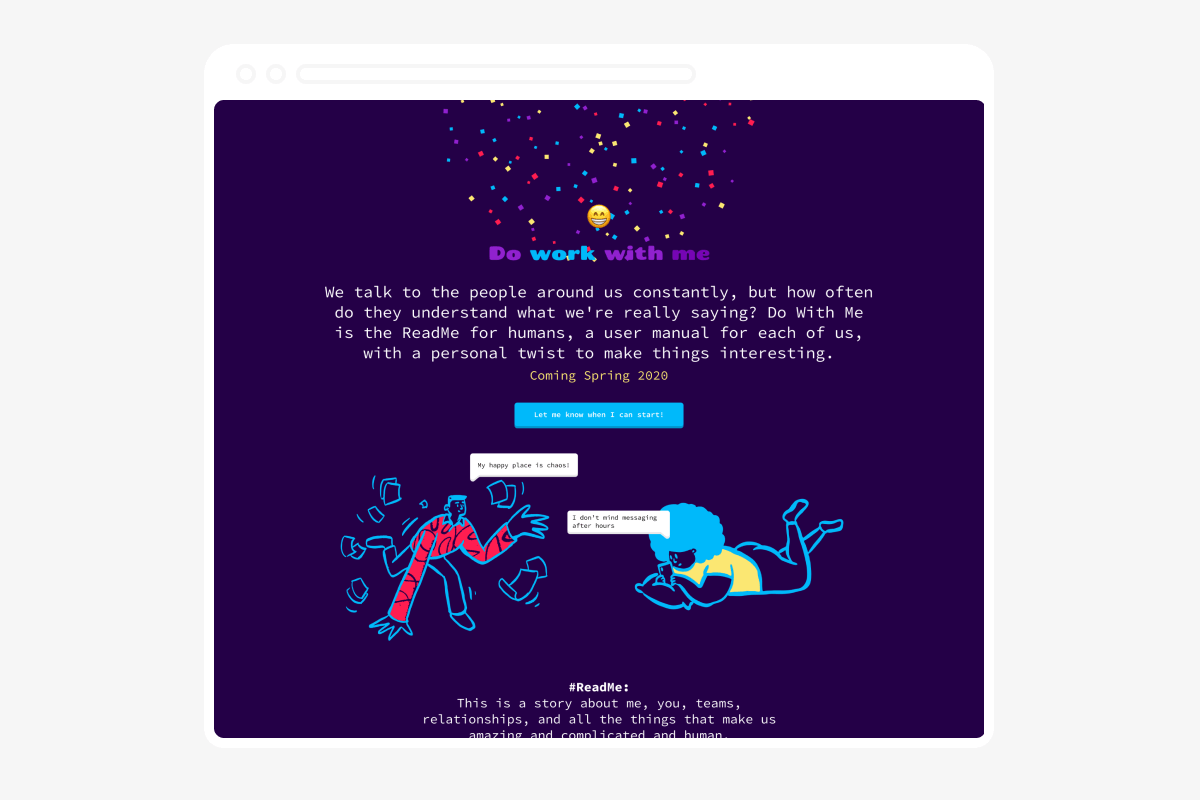
Do with me - The ReadMe for humans, a user manual for each of us.
A side project where we create a user manual for how we like to work. Think of it as a way to share all the little details that make each of us unique.
Go bookmark it for when we launch